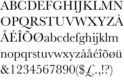
I have long been a fan of Garamond. It’s a very popular font based on a sixteenth century design, made especially popular by Adobe’s inclusion of their version (Adobe Garamond Premier Pro) in their Creative Suite.
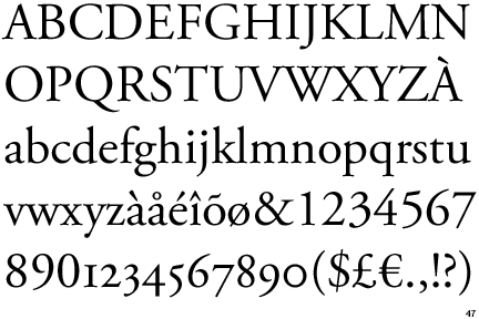
This font is especially useful for making liturgy programs (worship aids) in the Episcopal Church, because a close derivative of Garamond, called Sabon was used in the 1979 Book of Common Prayer, and continues to be used for official liturgical publications.
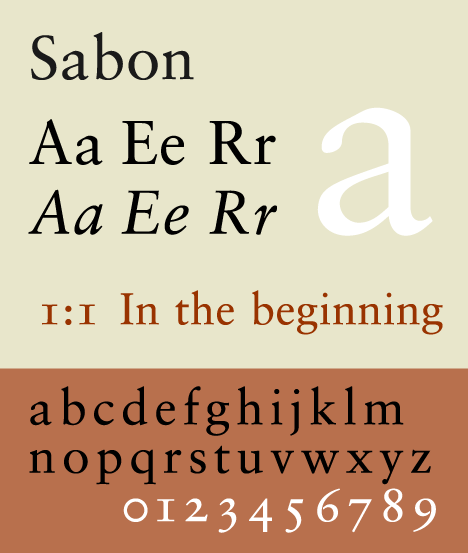
Sabon is not widely (freely) available, but Garamond is pretty common. (And few people can tell them apart.) For this reason, I have been using Garamond in programs for years. Most of the music I’ve published has been set in Garamond.
Except that’s not right.
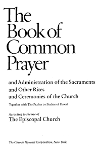
The Hymnal 1982 didn’t use Sabon/Garamond.
That’s Baskerville!
I have a theory about this. Okay, not a theory exactly — a handful of possible explanations.
-
Sabon seems to have been chosen at least in part because the italic, roman, and bold variants have the same horizontal size, which makes layout planning and editing much easier.
-
Sabon/Garamond is a font that hearkens back to the pre-Reformation period, while at the same time having been specifically adapted in the 1960s for modern use. From a typographical standpoint, one could hardly find a better font to express the Vatican-II-era Anglo-Catholicism that infused the text of the 1979 BCP.
-
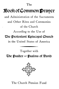
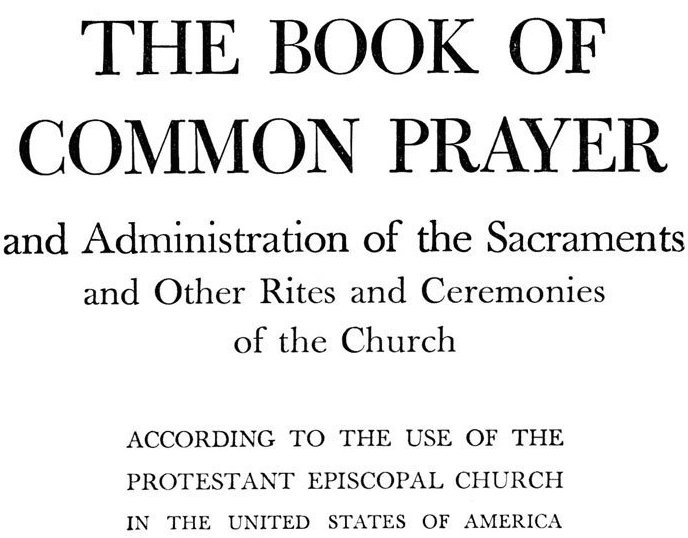
On a related note, Sabon/Garamond is both more modern and (because of its heritage) more traditional than the very (to my eyes) Protestant/Puritan feel of the previous edition. (Below is the 1928 original and the 1940s reprint.)
-
While the 1979 Book of Common Prayer was something of a leap forward for liturgical practice, and a definite lean towards Catholic practice, the 1982 was an essentially Protestant hymnal. However much we have changed the shape of the Sunday service, the Episcopal Church’s hymn tradition is, and will always be, Protestant. (Partly because there isn’t really much of a Catholic tradition of congregational hymnody.) For this reason, a font that stays within the realm of late 19th-century book making probably felt (even if only on a subconscious level) most appropriate.
-
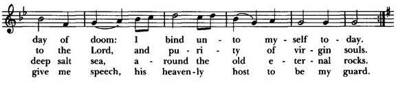
I am convinced that the average church-goer is much more attached to their hymnal then they are to their prayer book. Therefore, providing some visual continuity between the 1940 Hymnal and the 1982 certainly would have been prudent. The 1982 is a better-designed hymnal than the 1940, but there are clear similarities — the blue cloth cover being the most obvious. There is a close relationship between the font used in the 1940 (Bulmer) and the Baskerville of the 1982. Interestingly, that visual similarity is likely due to the fact that the designer of Bulmer, William Martin, worked in John Baskerville’s type foundry.
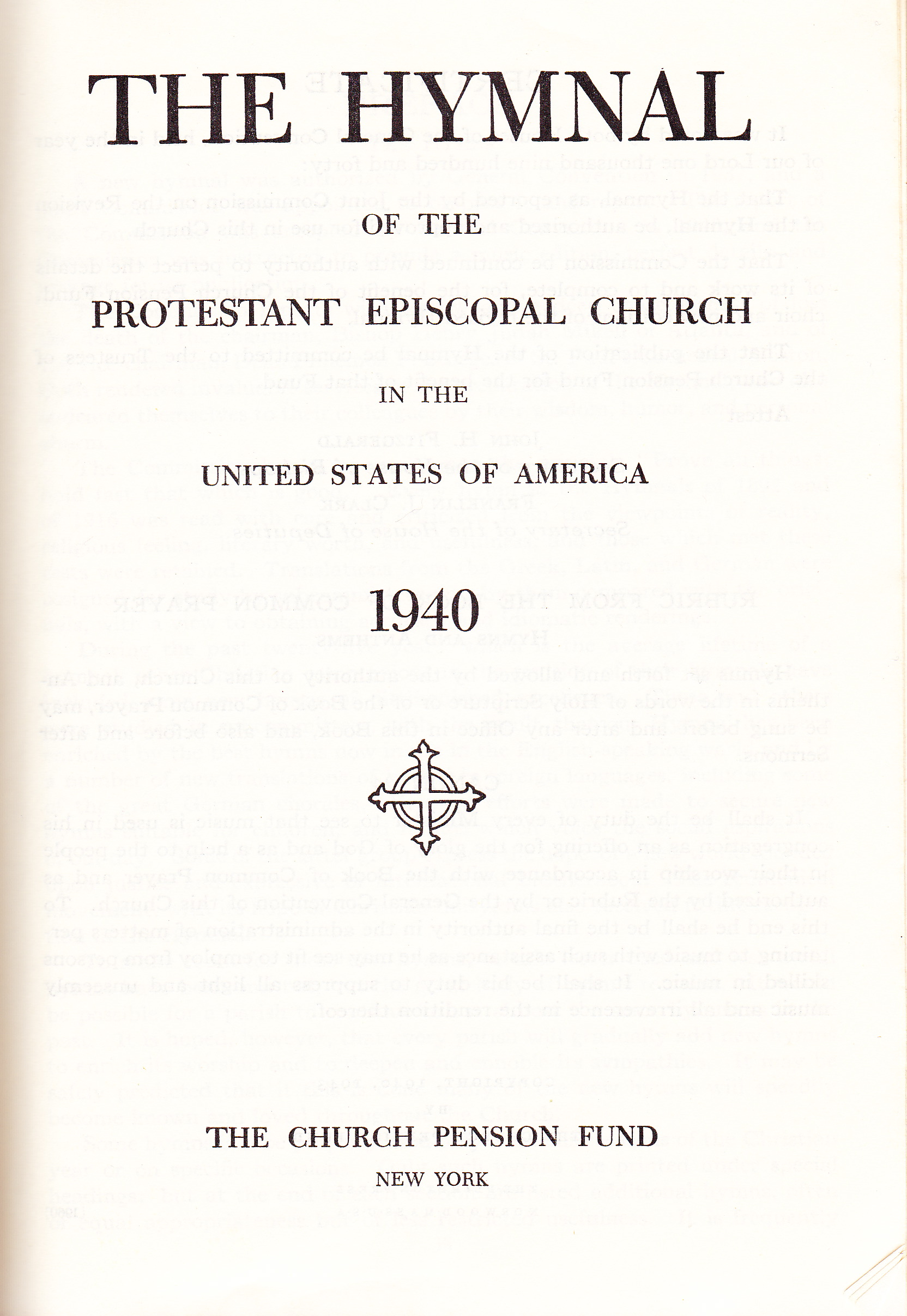
- Martin and Baskerville were both English. In fact, Bulmer was designed for the Shakespeare Press in 1792. This means that both the 1940 and and 1982 Hymnals use fonts designed by English Protestants in the late 18th century. The 1979 BCP uses a font designed in the 1960s by a German, based on a 16th century original designed by a French Catholic (and named after a 16th century French Catholic who lived and died in Germany). If this isn’t evidence of a Catholic-Protestant divide between Prayer Book and Hymnal, then I don’t know what is.
To top it all of, a 2012 poll found that Baskerville is the most credible font. That is — Americans are more likely to believe what they read if it is written in Baskerville, as compared with the other fonts they tested.
Discussion Questions:
-
Does Baskerville’s credibilty as a font contribute to Episcopalians’ affinity for the 1982 Hymnal?
-
Is Baskerville’s credibilty among Americans indicative of a particularly English and Protestant cultural ethos?
-
Would a change to a more “Catholic” font in a future church-wide hymnal change our musical ethos in any way?