A few years ago, in preparation for the diocesan convention in Fort Worth, there was a conversation about using projection screens in the liturgy (which was to be held in a convention meeting room, not a proper church building). I was not a party to this conversation, but my wife reported that someone stated that if she ever walked into an Episcopal church and saw projection screens, she would “walk out.”
Because there are people (and we all know them) who hold this kind of irrational distaste for anything that smells like innovation, it is sometimes difficult to hear the people who have legitimate concerns — practical, pastoral, and liturgical — about the use of projection screens.
The result of an inability to engage in productive conversation on topics like liturgical innovation leads to an unhealthy bifurcation where the majority remains largely insulated from change, and the minority forge ahead without thinking through how to solve the problems they create.
Whenever something is replaced by something else, there are things lost. The people obsessively concerned with that loss are irrational and should not be allowed to stand in the way of good and useful change. At the same time, those who forge ahead without concern for mitigating and dealing with loss are also irrational, and should not be allowed to run rough-shod over traditional liturgical practice.
There are definite benefits to projection screens:
- No paper waste.
- Congregational eyes up, instead of looking down.
- No one gets lost or confused by the program or prayer book.
But in the pursuit of these and other benefits, some of the benefits of the conventional paper-based solution are often lost, but which do not need to be.
A good principle should be:
Nothing that doesn’t need to be lost should be lost.
However, this is so rarely the case.
Switching from hymnals and printed worship aides to projection screens causes one unavoidable loss — the loss of a physical book to hold on to.
However, for a number of reasons (skill deficiency, laziness, lack of concern) additional losses usually occur, which do not need to:
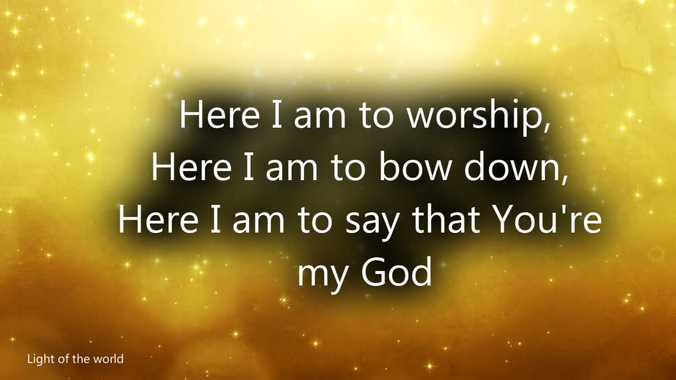
- Music notation. Many churches put only the lyrics on the projection screen.
- Dignified, traditional design. Projection screens often become cluttered with clip art and cheesy backgrounds.
Bad design is subjective, and I know plenty of people who think their gawd-awful WORDART and sentimental backgrounds are somehow helpful to the liturgy.

What is (I hope) less subjective is the extremely unfortunate situation caused by a lack of music notation. Hymn singing in church (for those who do it) is the primary way singers first learn to read music notation and sing in harmony. If we are going to retain any kind of non-consumption-based musical culture, we need to provide musical notation to our congregations. (And — oh yeah — make sure our children are in church to learn how to sing from.)

This (much too common) approach to putting songs onto projection screens has got to stop.
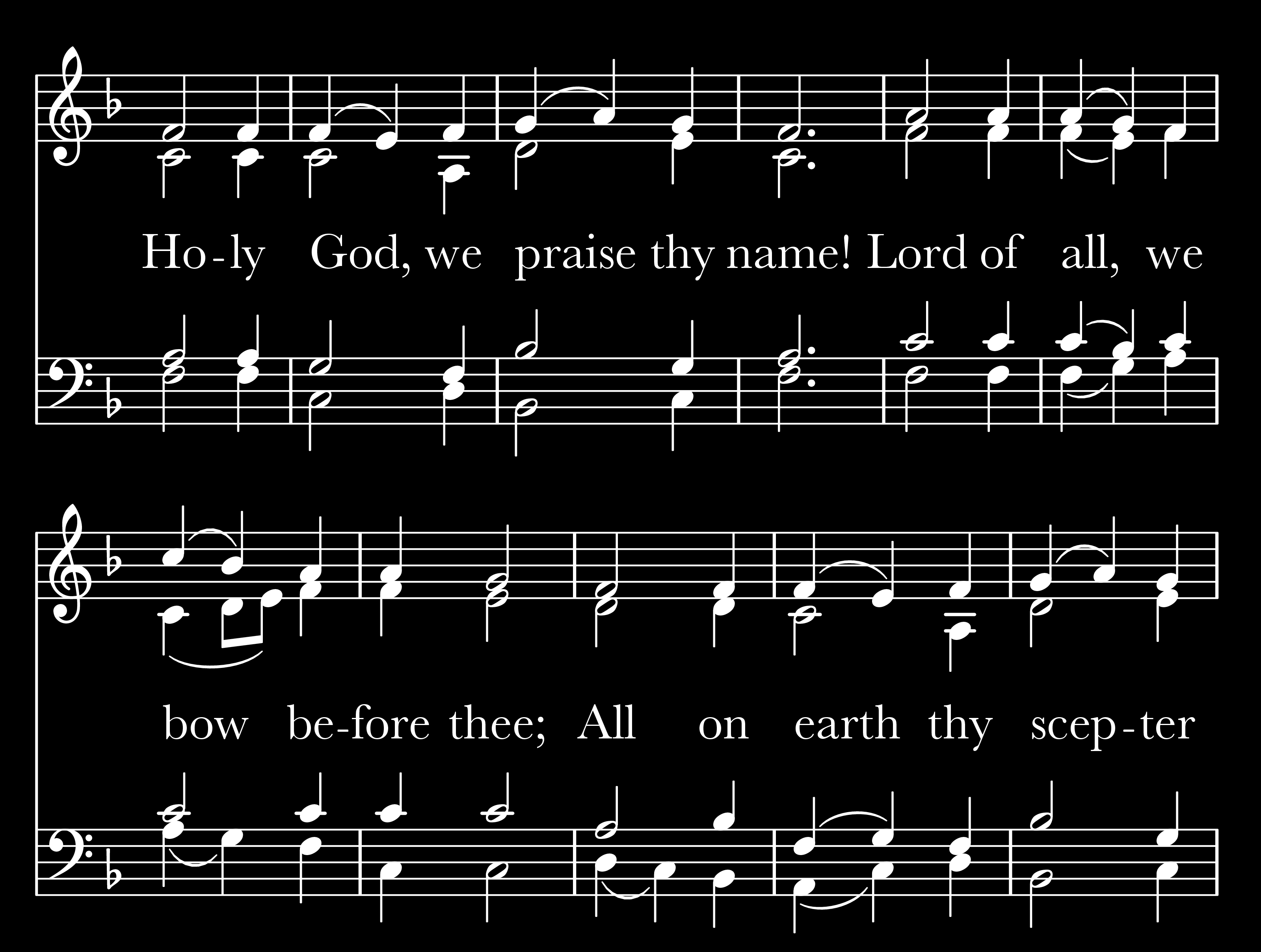
Here is a suggestion:

- All the music — four parts — is there.
- The lyrics are easy to read.
- There is no distracting artwork or cheesy font choices.
- Providing one verse at a time with music is easier to follow than in a hymnal.
- The back background makes the screen itself unobtrusive — only the content stands out, not the shape of the projection image.
This example was created entirely using Free and Open Source tools — the music was set in Lilypond and the image was cropped and color-reversed in GIMP. (You could easily use commercial software — Finale or Sibelius and Photoshop — if you wanted to.)
If you’d like to see a brief tutorial on how to use Lilypond and GIMP to create hymn screens like that, let me know in the comments. Also, be sure to subscribe.
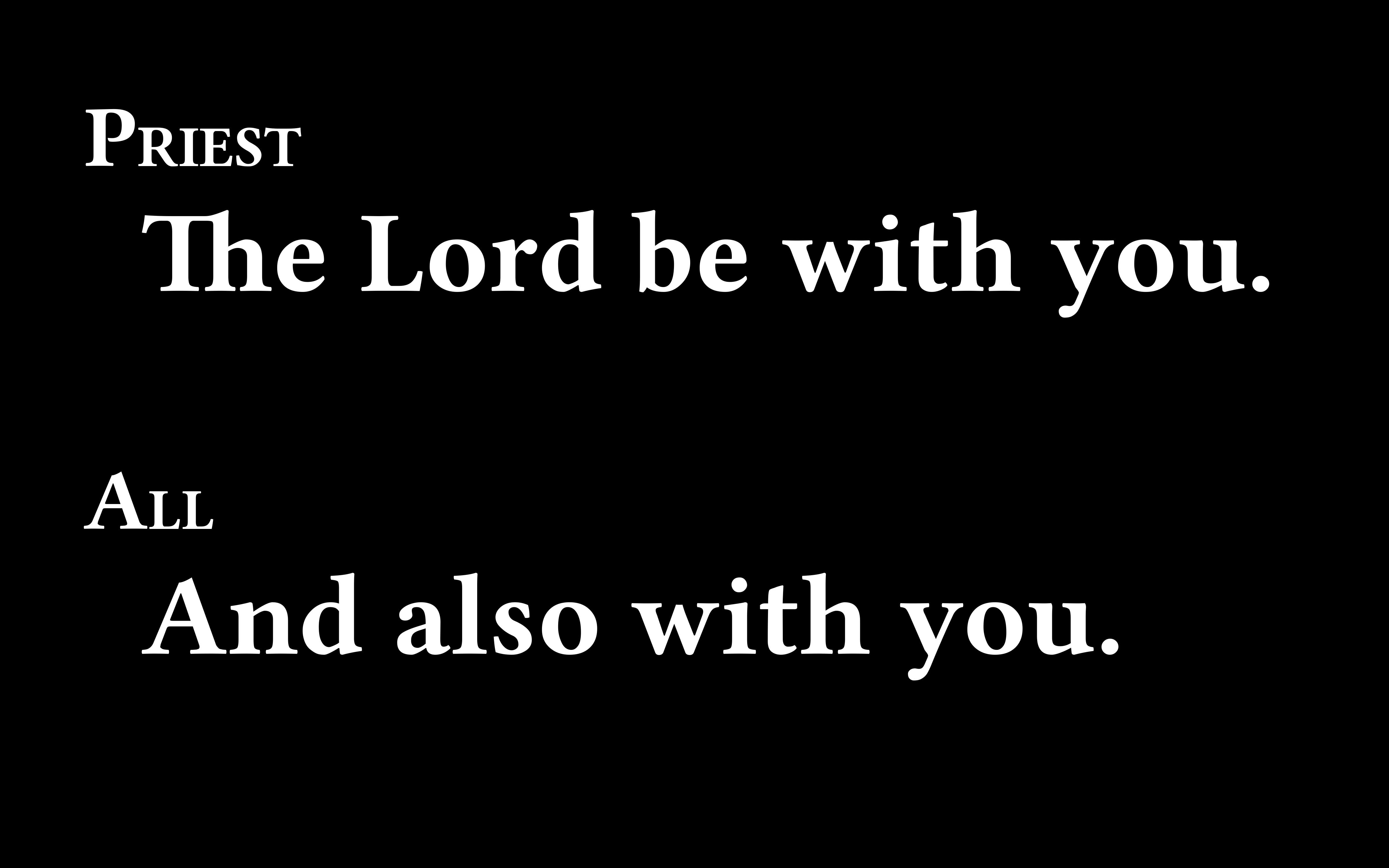
Projection screens can also be used — with the same minimally intrusive design — for the spoken portions of the liturgy.

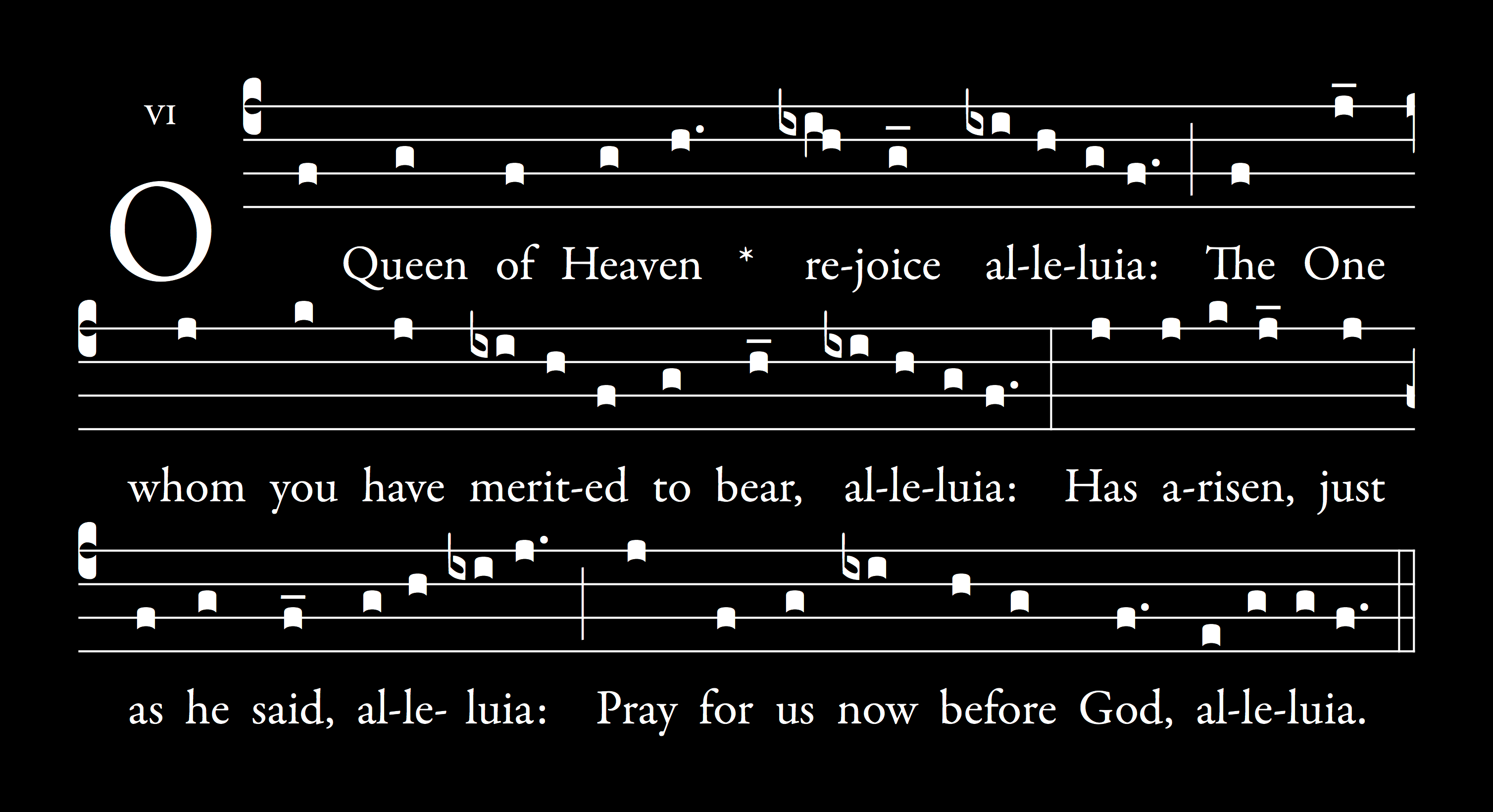
It also looks great with Gregorian chant.
